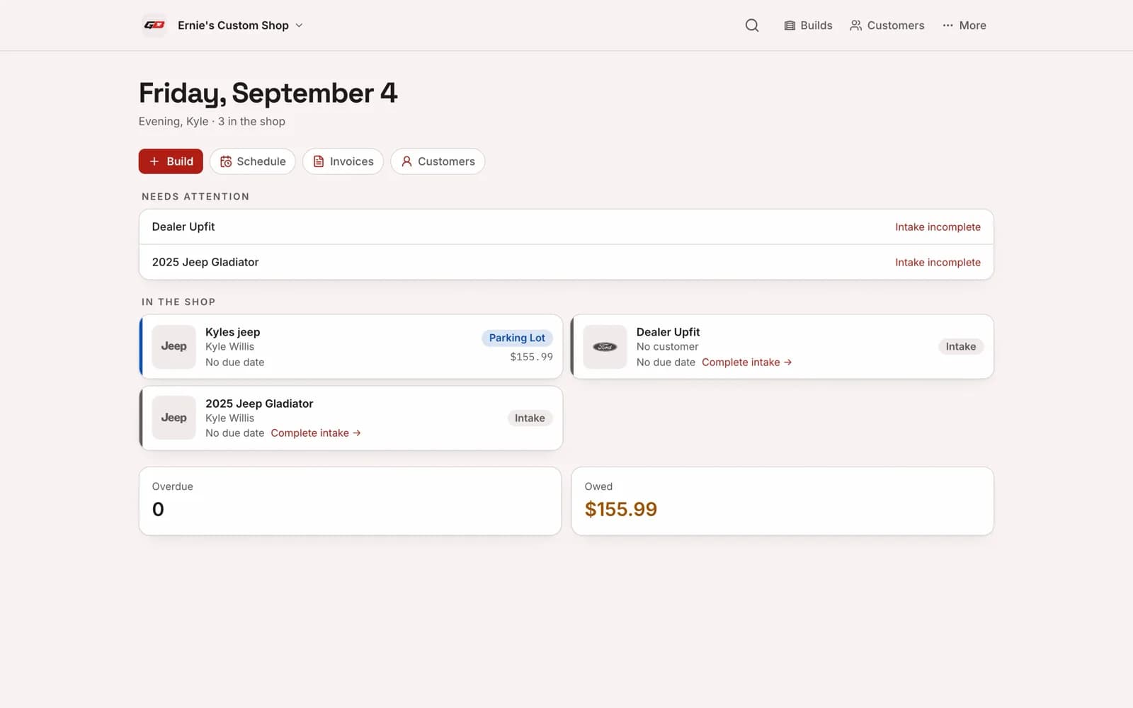
 Garage Bae
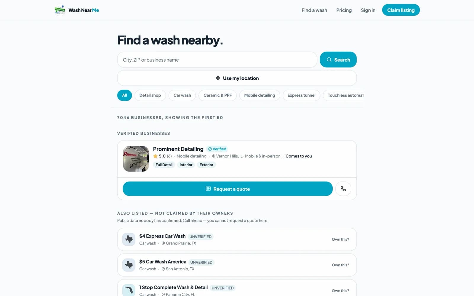
 Wash Near Me
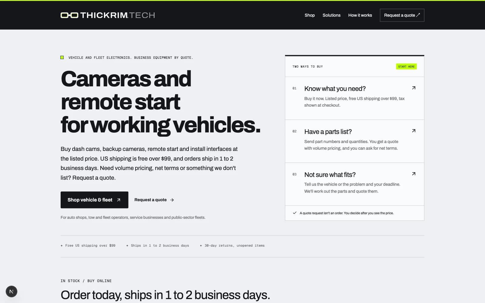
Style guide
The THICKRIM Standard.
The logo, the colours, the type and the words, for partners, press and anyone putting our name on something.
Overview
This is how THICKRIM looks and sounds, written once. If it isn't here, it isn't a rule yet.
We build websites, software and brands for the automotive aftermarket and other growing businesses, and keep them running. The job is to remove the friction between a good local business and its next customer, and the brand should read that way: plain, exact, and built to last.
Take logos and colours from the files on this page, never from a screenshot or an old deck.
Logo
A pair of thick-rimmed glasses, drawn on whole numbers. At 32 px tall, one unit is one pixel.
- Frame
- 100 × 32 units, rim 7 all round
- Clear space
- 8 units on every side: a quarter of the height.
- Size
- Smallest 16px. Core from 32px.
- Both lenses stay clear. Colour lives in the core band, never as a fill.
- No pins or added detail. The drawing is complete.
 On nightWhite, with the core in the lenses.
 On lightGraphite. Lime never sits on concrete or white.
 One inkBlack. Stamps, engraving, single-colour print.
 Small or squareThe frame alone, or the stacked lockup.
On a photo: in a pill, or on a solid ground. Never straight on the image.
Do
- Use the files exactly as they come.
- Keep the clear space, and the size floor.
- Let one core show per piece, at the edge.
- Credit client sites: Built by THICKRIM or Site by THICKRIM, linked to https://thickrim.com.
Don’t
- Recolour, outline, shadow, stretch, tilt or retype the mark.
- Redraw it, or ask an image generator for it or for brand art.
- Use a retired mark.
- Let anyone imply THICKRIM endorses their product.
Colour
Graphite is the brand. Concrete is the light ground; graphite 0 is night. The one colour, the core, shows only at the edges, like the middle layer of laminated acetate.
- Graphite 0#08090Cnight ground
- Graphite 1#14161Athe face, ink on concrete
- Graphite 2#292B2Fpanels and rules on night
- Graphite 3#616368muted text on concrete
- Graphite 4#96989Dmuted text on night
- Concrete 0#F9FAFBcards, paper
- Concrete 1#EEF0F3the page
- Concrete 2#DDE0E3wells
- Concrete 3#C8CBCEborders
The core
- Lime · Primary#BFFF00Never on concrete or white. No Pantone yet.
- Crimson · Alternate#C8102ELifted on dark. Pantone 186 C.
- B&W · Universal#14161AOne ink. Always works.
- One core per piece. Lime or crimson or B&W, never two.
- Once per view. About one part in fifty of any surface.
- Edges only. The lens band, a border, the side of a thing, one word on night.
- Never a fill. No core-coloured backgrounds, buttons or blocks.
Type
One family, Archivo, its width set by job; Geist Mono for code and data.
- NameTHICKRIMwdth 112, wght 650
- HeadHeadlineswdth 100, wght 760
- BodyBody, and strong.wdth 100, wght 400
- LabelSERVICE AREASwdth 85, wght 600
- Data10/22 · 32 × 100wdth 62, wght 560
- Suffix.COM LLCwdth 112, wght 420
How we write
Turn complicated information into clear, interesting, useful content for everyday business owners.
- Translate, don't just summarize.
- Lead with the takeaway.
- Use familiar words.
- Make technology feel accessible.
- Find the human angle.
- One memorable idea per graphic.
- Conversational, not childish.
- Curiosity without clickbait.
- Have a perspective.
- Optimistic, not hype.
Product brands
Garage Bae and Wash Near Me are ours, and each has its own look. Their own style guides are on the way; until then, here are their marks and the colours their pages use.
- Garage BaeShop management software for custom builders.Shop black#070707Garage red#B01D15Red on dark#DE4E40Paper#F5F0EESpace Grotesk for headings, Archivo for the rest.See Garage Bae
- Wash Near MeDiscovery and booking for car washes, detailers, tint, and PPF shops.Sky#F6FAFBNavy#0E2746Blue#006DE5Archivo, set like the app.See Wash Near Me

Defaults
What we use unless the work says otherwise.
- The name
- THICKRIM, all caps, one word. TR is never body copy.
- Credit
- Built by THICKRIM or Site by THICKRIM, linked to https://thickrim.com.
- Documents
- US Letter, set in Archivo, with logos from the downloads below.
- Dates
- 2026-10-23 in files and tables; Oct 23, 2026 in copy.
- Reply
- Within one business day.
Downloads
Every file as it ships: SVG for screens and print, PNG for slides, documents and social uploads.
- Lockup7 filesGraphiteWhiteBlackCrimson coreLime corePNG graphitePNG white
- Stacked lockup4 filesGraphiteWhitePNG graphitePNG white
- Mark6 filesGraphiteWhiteBlackCrimson coreLime corePNG graphite
- Lockup with descriptor4 filesGraphiteWhitePNG graphitePNG white
- Built by chip4 filesGraphiteNightPNG graphitePNG night
- Pill4 filesGraphiteNightPNG graphitePNG night
- Avatar3 filesLime coreCrimson coreMono
- Social banners3 filesShare cardLinkedInX header































Social
@thickrim everywhere. Profile pictures are the logo only.
Profile pictures
Banners